The Custom OG Images emitter plugin generates social media preview images for your pages. It uses satori to convert HTML/CSS into images, allowing you to create beautiful and consistent social media preview cards for your content.
Note
For information on how to add, remove or configure plugins, see the Configuration page.
Features
- Automatically generates social media preview images for each page
- Supports both light and dark mode themes
- Customizable through frontmatter properties
- Fallback to default image when needed
- Full control over image design through custom components
Configuration
Info
The
baseUrlproperty in your configuration must be set properly for social images to work correctly, as they require absolute URLs. WithoutbaseUrl, no image meta tags are emitted.
Each page gets an image at <slug>-og-image.webp; pages with a socialImage in their frontmatter are skipped.
This plugin accepts the following configuration options:
plugins:
  - source: "@quartz-community/og-image"
    enabled: true
    options:
      colorScheme: lightMode # "lightMode" or "darkMode"
      width: 1200
      height: 630
      defaultTitle: Untitled
      defaultDescription: No description provided
      useGeneratedDescription: true
The options that take functions (imageStructure, readingTimeText) need the TS override approach:
import * as ExternalPlugin from "./.quartz/plugins"
import { myImage } from "./socialImage"

// Must be placed before loadQuartzConfig()
ExternalPlugin.CustomOgImages({
  colorScheme: "lightMode",
  imageStructure: myImage, // omit to keep the built-in design
  readingTimeText: (minutes) => `${minutes} min read`,
})
Configuration Options
| Option | Type | Default | Description |
|---|---|---|---|
colorScheme | string | ”lightMode” | Theme to use for generating images (“darkMode” or “lightMode”) |
width | number | 1200 | Width of the generated image in pixels |
height | number | 630 | Height of the generated image in pixels |
defaultTitle | string | ”Untitled” | Fallback title when a page has no title |
defaultDescription | string | ”No description provided” | Fallback description when a page has no description |
useGeneratedDescription | boolean | true | Use a generated description (the Description plugin’s excerpt of the page) when the frontmatter has none. Set to false to show defaultDescription instead |
readingTimeText | function | `${minutes} min read` | Formats the reading time shown by the built-in design (TS override only) |
imageStructure | component | built-in design | Custom component to use for image generation (TS override only) |
The description on an image is, in order: the frontmatter’s socialDescription, its description, the generated description (unless useGeneratedDescription is false), and finally defaultDescription. With the Description plugin enabled, every page with text has a generated description, so defaultDescription mostly shows with useGeneratedDescription: false.
Frontmatter Properties
The following properties can be used to customize your link previews:
| Property | Alias | Summary |
|---|---|---|
socialDescription | description | Description to be used for preview. |
socialImage | image, cover | Link to preview image. |
The socialImage property should contain a link to an image either relative to quartz/static, or a full URL. If you have a folder for all your images in quartz/static/my-images, an example for socialImage could be "my-images/cover.png". Alternatively, you can use a fully qualified URL like "https://example.com/cover.png".
Info
The priority for what image will be used for the cover image looks like the following:
frontmatter property > generated image (if enabled) > default image.The default image (
quartz/static/og-image.png) will only be used as a fallback if nothing else is set. If the Custom OG Images emitter plugin is enabled, it will be treated as the new default per page, but can be overwritten by setting thesocialImagefrontmatter property for that page.
Customization
You can fully customize how the images being generated look by passing your own component to imageStructure. This component takes JSX + some page metadata/config options and converts it to an image using satori. Vercel provides an online playground that can be used to preview how your JSX looks like as a picture. This is ideal for prototyping your custom design.
The component receives a single object:
| Property | Description |
|---|---|
cfg | The global configuration (cfg.theme.colors, cfg.baseUrl, cfg.locale, …) |
userOpts | The plugin options (colorScheme, width, height, …) |
title | The page title (or defaultTitle) followed by pageTitleSuffix |
description | The description (see above) |
fonts | The fonts loaded for satori |
fileData | Page data: slug, frontmatter, description, text, filePath, dates |
iconBase64 | quartz/static/icon.png as a data URL, if present |
Fonts
fonts contains the header font followed by the body font, matching theme.typography.header and theme.typography.body from quartz.config.yaml, in the format required by satori. They are downloaded from Google Fonts (cached in .quartz-cache/fonts); if that fails, a system font is used, and if no font is available at all, image generation is skipped with a warning. To use them in CSS, use the .name property (e.g. fontFamily: fonts[1].name to use the “body” font family).
An example of a component using the header font could look like this:
import type { SocialImageOptions } from "@quartz-community/og-image"

export const myImage: SocialImageOptions["imageStructure"] = ({ fonts }) => {
  return <p style={{ fontFamily: fonts[0].name }}>Cool Header!</p>
}
Examples
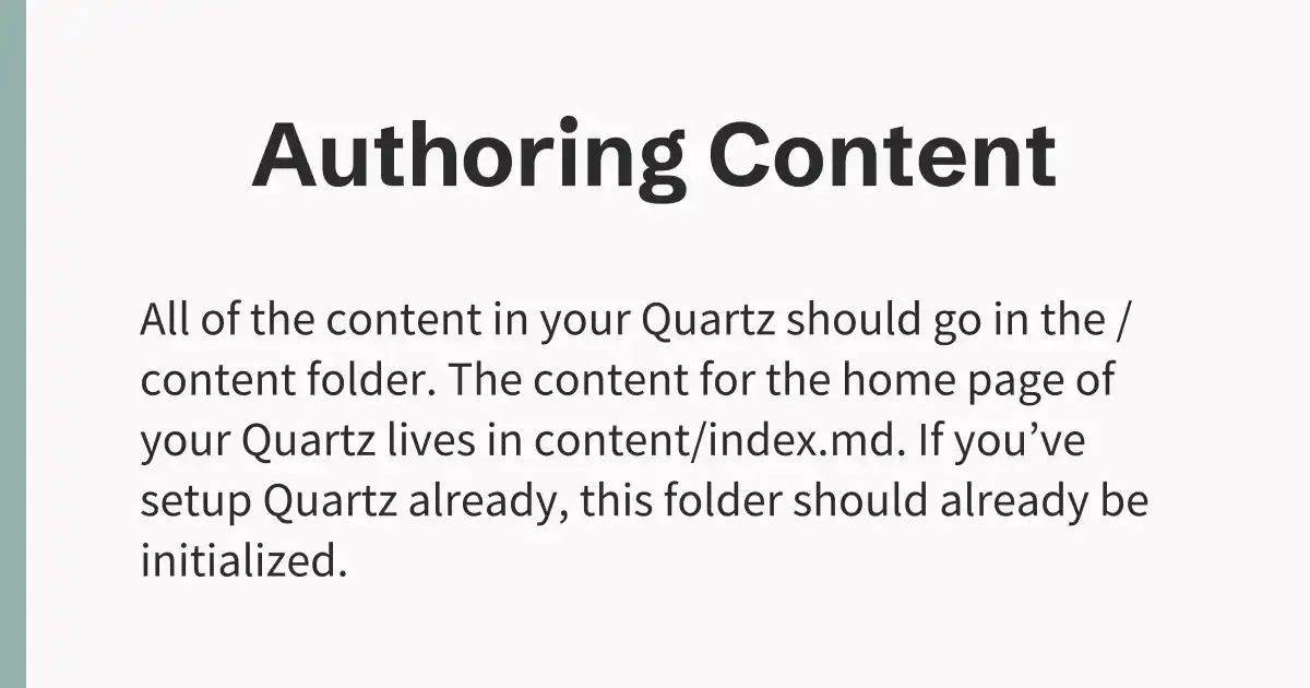
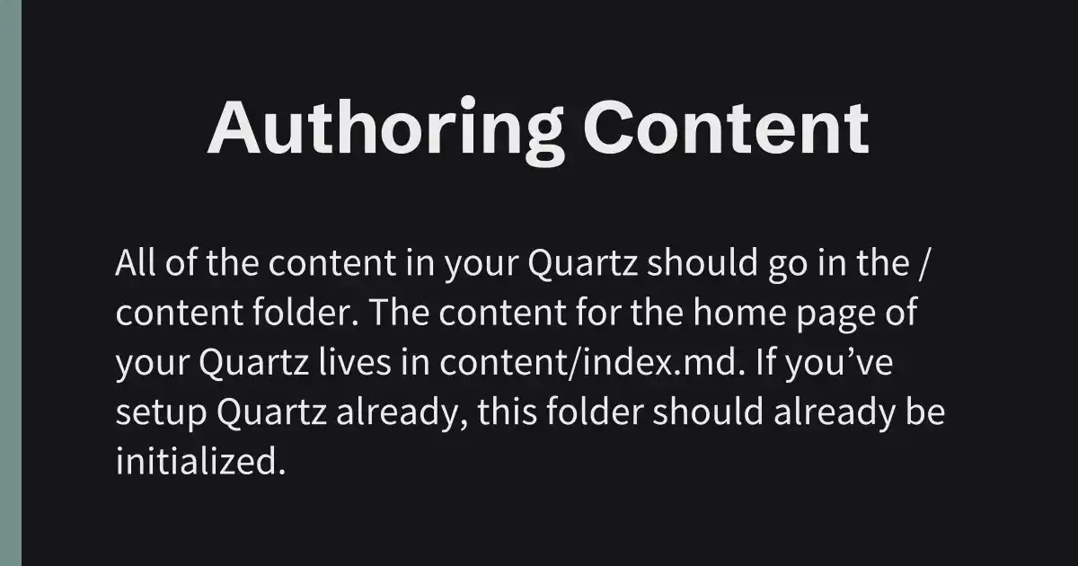
Here is an example image component you can use as a starting point. It generates images that look as follows:
| Light | Dark |
|---|---|
 |  |
import type { SocialImageOptions } from "@quartz-community/og-image"

export const customImage: SocialImageOptions["imageStructure"] = ({
  cfg,
  userOpts,
  title,
  description,
  fonts,
}) => {
  // How many characters are allowed before switching to smaller font
  const fontBreakPoint = 22
  const useSmallerFont = title.length > fontBreakPoint

  const { colorScheme } = userOpts
  // `cfg.theme` is typed `unknown` in @quartz-community/types
  const colors = (cfg.theme as { colors: Record<string, Record<string, string>> }).colors[
    colorScheme
  ]
  return (
    <div
      style={{
        display: "flex",
        flexDirection: "row",
        justifyContent: "flex-start",
        alignItems: "center",
        height: "100%",
        width: "100%",
      }}
    >
      <div
        style={{
          display: "flex",
          alignItems: "center",
          justifyContent: "center",
          height: "100%",
          width: "100%",
          backgroundColor: colors.light,
          flexDirection: "column",
          gap: "2.5rem",
          paddingTop: "2rem",
          paddingBottom: "2rem",
        }}
      >
        <p
          style={{
            color: colors.dark,
            fontSize: useSmallerFont ? 70 : 82,
            marginLeft: "4rem",
            textAlign: "center",
            marginRight: "4rem",
            fontFamily: fonts[0].name,
          }}
        >
          {title}
        </p>
        <p
          style={{
            color: colors.dark,
            fontSize: 44,
            marginLeft: "8rem",
            marginRight: "8rem",
            lineClamp: 3,
            fontFamily: fonts[1].name,
          }}
        >
          {description}
        </p>
      </div>
      <div
        style={{
          height: "100%",
          width: "2vw",
          position: "absolute",
          backgroundColor: colors.tertiary,
          opacity: 0.85,
        }}
      />
    </div>
  )
}
Page dates are available as fileData.dates?.created / modified / published (with CreatedModifiedDate) and the page text as fileData.text, for example to show a date or reading time.
API
- Category: Emitter
- Function name:
ExternalPlugin.CustomOgImages(). - Source:
quartz-community/og-image - Install:
npx quartz plugin add @quartz-community/og-image